Tuesday, June 16, 2009
Monday, June 15, 2009
FINAL DRAWINGS

1:50 Section through Small Gallery Room

Ground Floor Plan

First Floor Plan

Second Floor Plan

Section A

Section B

Section C

Left: Front Elevation
Middle: Short Section
Right: Short Section

Left: Short Section
Middle: Short Section
Right: Short Section

Axonometric

Perspectives

Perspectives

Perspectives

Site Plan + Site Analysis (this page didn't scan properly, so I had to photograph it, which is why it is not so bright or clear as the other drawings)

Building Description
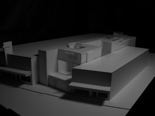
My design is an art gallery for a stencil artist, to promote graffiti as an art form. Given the location amongst Newtown, inner city, and quite trendy, on the edge, I felt graffiti was an appropriate kind of art for the location. Often this is seen as vandalism, so the gallery gives a chance to present it as an art form.
I divided the building requirements into three areas: public gallery spaces, private work/admin spaces, and private apartment spaces. I imagined these as three long paths that could then be wrapped around each other through the length of the site, whilst still allowing light to penetrate all the spaces. I also tried to incorporate some of the artistic ideas into the scheme: disruptive parts, crashing and winding through each other, jumbled, interweaving and layered.
Circulation/organization:
Small Gallery: gallery occupies the bottom floor, as it needs to be a public area with disabled access. The path winds its way across the site, through a narrow smaller gallery. This is more of a path than an open space to wander, and it encourages movement. Here I would imagine you could see the kind of works done on the streets: these are often very quick, fast, and convey their message almost instantaneously. They are meant to be viewed by people walking down the street, driving their cars etc, people who would not stop to look at the graffiti for very long. I wanted the total encompassing feeling of the art to create a similar idea to the ‘underpass’ in train stations, where graffiti often covers every available inch of space. For light sources, I have used a series of jagged cut windows into the roof and walls of the path. I wanted to create random, scattered light that both reflects the art work, and the conditions in which it would normally be viewed.
The main gallery located further at the back is still for street art, but here are the works that an artist might spend much more time on, they take more time to view, think about, and the larger space allows you to wander around them and view at your own discretion. To avoid the building becoming two distinct spaces (the paths at the front, and the big gallery at the back), I tried to have many of the paths break through this gallery, winding along the top or middle floors, to animate the building in a similar way to the artwork that it holds. I felt for this gallery space, a much more constant and even light is needed to view and contemplate these artworks. Still wanting to keep with the ideas of the room, crashing and disrupting, I created a series of lightboxes that break through the ceiling, but allow a diffused light to spread across the space, making it appropriate for viewing art.
As you leave this gallery, you walk outside and wander amongst the winding parts of the building, through a sculpture garden. I did try to ensure that the final part of the sculpture garden is very sunny (a necessity for the program), so I have avoided placing too much obstructions above this part of the garden.
The office and work space is raised above the site, onto a third level. This gives enough room for light to enter the lower spaces. The office is located at the front, overlooking the street, and can be accessed from the street as well. There are a series of workshops and storage spaces located along this path. The first workshop overhangs the garden, and has a large glass wall that allows people in the garden to see the works that are being created. The second workshop winds its way across the width of the main gallery, and can also be seen by people inside. Workspaces here are given the most light, with large windows and skylights that allow plentiful natural light to work in. Storage spaces have only minimal sized windows, the necessity to see in a space that is not occupied for long.
The apartment is the final path, and is wound between the other two. It is accessed from the rear, as I tried to keep it more private than the other spaces. The workshops can be accessed from the apartment: I felt the owner may often want to work on his own art, or otherwise he is very involved with the artists working around him, and would want a quick and easy access to what they are doing.
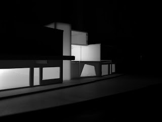
Materiality: I wanted to use a thin fibre-reinforced plastic. This material is light and can be used to create the large cantilevers and winding paths of the building. It also has a slightly opaque quality, so when lit from the interior, the building appears to glow slightly. Again I wanted the gallery to evoke the ideas of a bright, eye-catching piece of graffiti on the street. This also allows the sculpture garden to be lit at night from these glowing ‘boxes’ or paths. The floors and internal walls of the first gallery would be concrete, a grittier material more commonly associated with graffiti.
Subscribe to:
Comments (Atom)


